Showing posts with label Evaluation. Show all posts
Showing posts with label Evaluation. Show all posts
Monday, 15 April 2013
Sunday, 14 April 2013
Evaluation - Part 3
How did you use media technologies in the construction, research and planning and evaluation stages?
Audience Feedback and Evaluation - Part 2
What have you learnt from your audience feedback?
AUDIENCE FEEDBACK COMMENTS:
"It was pretty tense. You managed well in making me feel uneasy while watching. the actors were both very mask faced and this adds to the tense feeling. I didn't understand what you want to say at the end though. I would suggest that the candle is shown with a flame then goes off. It adds to the excitement. Good luck sweet heart."
"I think you did a good job.I agree that it made me feel anxious about the events ,the music added more suspense to the movie.The clocks also created a good effect."
"Really tense and unsettling viewing. I think the use of symbols to do with time was really clever and I liked the way it was filmed from a variety of angles for different effects. Thought it was great and if it was a film trailer I'd want to go see it."
"Really, really good. I loved the way the character wakes up in the dream, thought the clocks were sort of trippy. You balanced the silence out well with the sound effects to tell the story without dialogue."
"I was confused by the plot, but it doesn't mean that it wasn't effective. Surrealism works great in a short film because it doesn't have to make sense. Loved it."
Saturday, 6 April 2013
Evaluation - Part 1
How effective is the combination of your main product and ancillary task?
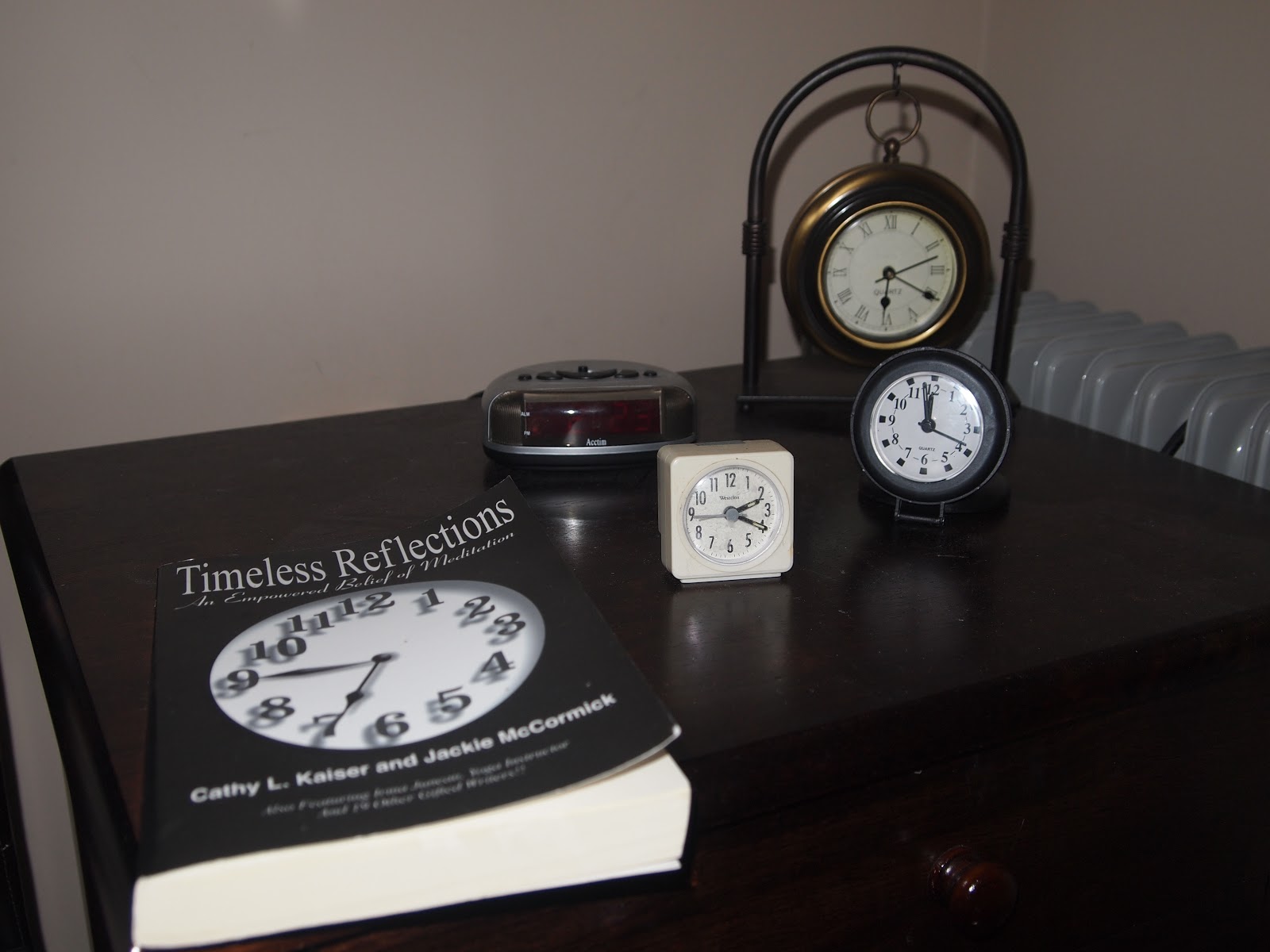
 The film poster was created using Adobe Photoshop which enabled me to experiment with a variety of fonts, layouts and tools to create a desired and final outcome. I used a simple photograph of the variety of clocks used as props in my product; this photo is very symbolic and relevant in suggesting the film's plot directly. The photo implies the importance of time as a concept and element in the feature, which the character strongly vows to organise - multiple watches suggest a form of OCD. I edited the photo to allow a white, blank background which portrays the watches as the central focus and attention, as they attract attention instantly. The poster therefore suggests a hint as to what the feature is about, using a simple font to imply the cast, production company and title in itself. Photoshop allowed me to experiment with a variety of styles, I felt that to portray my independent art house feature; a simple poster is more effective opposed to mainstream poster styles that show main actors/ actresses without implying what the film may be about. I find that the combination of my film poster and product effective in reflecting each other - the group of clocks in a variety of shapes, types and sizes cause intrigue as the use of props is strange - successfully reflecting the bizarre, surrealist genre. The adding of my production and release company logos and 'Sundance' award logos added at the bottom of the poster allowed a professional feel and enhancing of it's independent genre;. For it to be nominated for a well known film festival that is known for exhibiting art house an independent releases, my film can attract a large audience and gain recognition. The monochromatic style of the poster also suggests an older and unclear time scale; which I imply in my media product through the portrayal of imagery and a contrasting sound-scape yet absence of dialogue. Silent films are often associated when films were first introduced due to the lack of technology, therefore the colour palette of my poster implies an older time era. My characters transportation to the dream state, shows an interaction between a mysterious female, 'Unknown Female', I felt that my poster did not need to suggest the characters to create suspense and intrigue to the viewers before watching the product. It also successfully portrays similar aspects of minimalism through Independent film poster conventions and the use of props or locations to reflect the story-lines of the film.
I find that the creation of my ancillary tasks enabled me to successfully promote my film using relevant products that depict the film genre; creating simple poster and magazine layouts to create intrigue and imply the art-house, independent feel of my Surrealist feature. Audience and viewers may not all be familiar with the bizarre concepts of Surrealism therefore it is relevant to create distributive ancillary tasks to aid in the exhibiting of my feature, such as through the creation of poster and magazine review. My media product and tasks reflect each other well in terms of depicting genre and conventions, through the simple layout of the poster to cause intrigue; it uses those conventions of real life Independent film posters that I studied such as 'The Machinist'. A film poster of mainstream romantic comedy's would focus on the portrayal of main casts and characters opposed to symbolic prop use. I am therefore overall pleased with the combination of the products in how they represent the plot of the feature, such as through the use of the still shots portraying the most important shot of my character's frustration regarding time in a dream state.
Thursday, 28 February 2013
Ancillary Task - Magazine Review
A BFI Sight and Sound Magazine inspired film review for the Persistence of memory is simple yet effective; I chose a classic image of my main character as he glances at his watch in his 'dream' setting. This image is strong in it's meanings; the most effective in suggesting his frustration in losing his time keeping. The soil can be seen in the image; it's symbolic denotations refer to the brevity of life and the empty crystal glasses a fond, lost memory. This still image from the film is most effective in implying the main concept of my surrealist feature. I chose a simple font, remaining neural which contrasts effectively to the white, crisp background. The review is in essay style, columns keep it simple and tidy without too much clutter. The 'FILMS' banner at the top is similar to what would usually be seen in a magazine, to identify the type of article being read, with information below such as the heading in large title size. The large size allows the viewer to identify the name, below are details about the film such as cast, film length and director. I inserted the dark lines to create a border and allows separation between the magazine sections, and important information regarding the film is highlighted with the use of italics to allow the audience to identify them easily. I feel that this image works well with my film; being a snapshot of the highest tension point where the character feels all frustration - this captivates readers and audiences in wondering why this character is concerned, and why these props are there. We want to understand what he is thinking, and what will happen.

Wednesday, 27 February 2013
Ancillary Task - Film Poster
The ancillary task of creating a movie poster has allowed me to challenge the use of technology and ways in which I could effectively, yet simply portray aspects of my surrealist feature for distribution terms. I choose the aspect that less is of course more; I choose to simply show a black and white blank page with the many alarm clocks used in the making of my film as props. After importing the images into Adobe photoshop, I used the brush tool to erase the background, softening the edges of the image to allow them to blend in the background. A white background was most effective to create a subtle hint of these props and the denotations that they present in being very influential and key to the plot. Due to my main character not actually developing that much in terms of his character throughout the film, I feel that placing his face would be most irrelevant; taking key Independant movie poster conventions and adapting then to present my film subject through the symbollic use of props.

The variety of clock types seem to suggest that we are unaware of the actual era, ironically; such as the digital alarm clock contrasts to the old fashioned, bronze hanging clock in the image. The book displays a large clock face, the bold titling of 'Timeless Reflections' suggests how memories are most persistent, and regardless of time they are most important to us - which can be seen in the dream like state where the character is exported after he falls asleep. My poster is in monochrome; the central clock image adds to the effect of time being almost transparent as it is thrown in the centre of the blank page. It is clearly the most important prop and is up to the viewers interpretation; they can simply see that this concept is crucial to my film's idea. I chose the font as it is simple; using black as it contrasts and looks sharp against the emptiness of the white background. I used my ident logos from my AS work; the use of 'Phantasm Films' and 'Illusion Images' can be seen at the bottom of the page; with the Sundance Film logos that are usually used in the promotion of films. I chose not to add a tagline, to create a mystery and leave the audience to interpret what the film is actually about. I added a line however which suggests that the film is in Salvador Dali's influences, again this being a central point - simply with the fact that the title in itself is his painting's name. The web address adds to the formality and promotion of my feature suggesting that audience members and viewers can find out more if they visit the website.


Wednesday, 16 January 2013
Editing Process of 'The Persistence of Memory'


AUDIO/ SOUNDTRACK
I used copyright free sounds online including a horror ambiance/ surrealist soundtrack which work very effectively in the making of my film - sounds such as insects and ticking clocks were indeed very relevant in building tension. A heartbeat in particular was very significant in the sense that it could sync well with the ticking clocks; a strong association can be made between the rhythmical beating of the two. I feel the I effectively created tension, the use of the bending tool allowed me to create the most significant melting, distorted clock effects which I had shot with acrylic paint over; this is crucial to the scene where time no longer becomes relevant. I feel that I was able to use the well together to create a bizarre transition in the film as soon as my character falls asleep.
Thursday, 29 November 2012
After Effects Use - Melting Clocks
 After Effects was a suggested option in which I could attempt to distort the clocks used in the opening scene of the film; I have used footage with acryclic paint and clock faces (out of focus) in the background of a variety of closeup shots. The 'Liquify' tool enabled me to distort the clock faces; sub-categorized tools include 'Warp', 'Bloat' and 'Twirl'. These effects suggest the irrelevance of time prior to the dream sequence - my film contains two different locations, therefore a stress in the contrasting environments. Further work on After Effects would enable me to animate a sequence in terms of it's shape transformation using the timing tools to adapt the shapes, on a time scale.
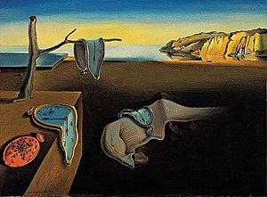 |
| 'The Persistence of Memory' painting by Salvador Dali |
 |
| 'Liquify' effects on the clocks |
Sunday, 25 November 2012
Filming - 'The Persistence of Memory'
PREPARATION - VINYL MELTING AND MANY CLOCKS

The clock is not functioning in this scene, the bowl is filled with soil and the crystal glasses are empty. The connotations of the soil in Unknown Female's palm are almost similar to Un Chien Andalou with the ants. I will portray my ants/ insects through scuttling sound effects and some manipulation of the shots.

Take my advice, NEVER PLACE VINYL IN THE OVEN. THE FUMES ARE HORRENDOUS. After my plan to replicate melting clock shapes, it was unfortunately unsuccessful. The vinyl was left for too long and before I was aware it was very melted. Luckily, that was a last resort and my many gathered clocks collected from friends would be used in the opening scene. I have purchased cheap alarm clocks and the use of acrylic paint can be used to suggest the melting. Perfect.

The dream state scene is in the dining room, where my character will be transported. My props have been organized; using crystal glasses and bowl and candle holders. I have placed. A large clock which will not be functioning to emphasize the irrelevance of time.
 |
 |

Subscribe to:
Posts (Atom)